Are you looking for a font on Canva for your menu?
Whether you are interested in a flowery, artistic font to match the vibes in your roadside café or a simple and legible font for your fast food joint, we’ve got you covered.
In this post, we will be covering the 10 best fonts for menus on Canva. Let’s get into it!
10 Best Canva Fonts For Menus
1. Lavonia Classy
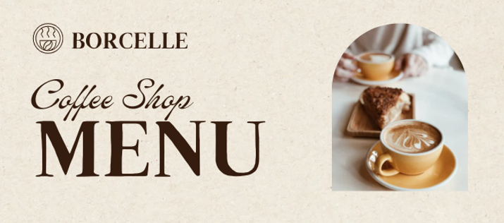
Lavonia Classy is a calligraphic font that is perfect for restaurant names. In this example, the words “Coffee Shop” use the Lavonia Classy font.
While I wouldn’t put the whole menu in this font, it’s great for such types of intro headers, just to add a bit of style and flair.
2. Brixton
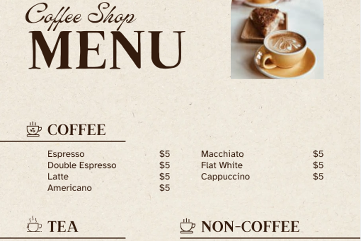
While the name of your shop can be written in a flowery font, you don’t want the actual menu items to be in a calligraphic font.
That’s because you want to make it as easy as possible for people to read.
For the menu subheaders, you can choose a large, bold, and legible font like Brixton. See the example above: The menu subheaders (Coffee, Tea, Non-Coffee) are in the Brixton font. Furthermore, the word “Menu” itself is in the Brixton font as well.
3. Atkinson Hyperlegible
For the menu items themselves, you will want something that is a bit less bold. However, it should still be legible. Atkinson Hyperlegible is a good font to use.
As the name suggests, it is very easy to read!
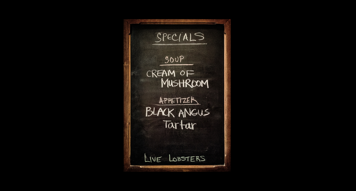
4. Cormorant Garamond
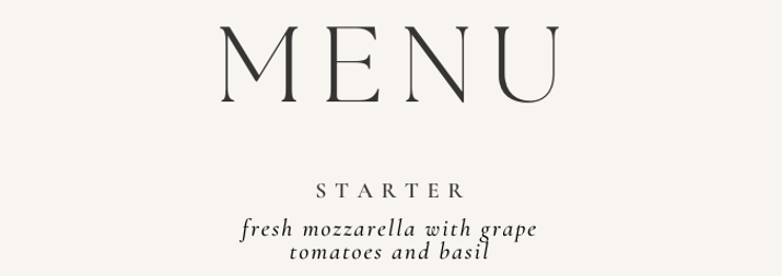
Take a look at the word “Starter” in the screenshot above. It is written in Cormorant Garamond.
This is a font that naturally has a lot of spacing. It is perfect for menu headers because it stands out and is effortless to read.
If someone is quickly perusing through a menu, they can scan the headers easily if you use a font like this.
Actually, the menu items (“fresh mozzarella with grape tomatoes and basil”) are also written in Cormorant Garamond. The difference is that they are in italics.
As you can see, it is great for menu items as well. It is still very legible, but if you wish to add a bit of an artistic flair to the menu, you can simply make it in italics. This is great for upscale restaurants!
5. Eyesome Script

Eyesome Script is a calligraphic font that is great for the name of your restaurant or bar.
It is also great for menu categories in bars and pubs because in these establishments, people usually have the time to peruse through the menu with leisure (unlike in a coffee shop).
As you can see in the screenshot above, the word “Drinks” features the Eyesome Script.
6. RoxBoroughCF

Meanwhile, for menu items and subheaders, RoxBoroughCF is a great font to choose. It is simple and legible, making it easy for people to read the menu items.
You can see an example of how it is used for menu subheaders and menu items in the screenshot above.
7. WC Mano Negra Bold
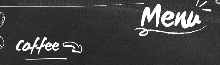
You can use WC Mano Negra Bold for your restaurant name or main menu headers. It is a bold font, as suggested by the name, but it has just a touch of artistic flair to it, making it a great addition at the top of your menu.
In the screenshot above, both the words “Menu” and “Coffee” are using this font. They are only different in size.
As you may have noticed, it performs particularly well when you are aiming for white text on a black background.
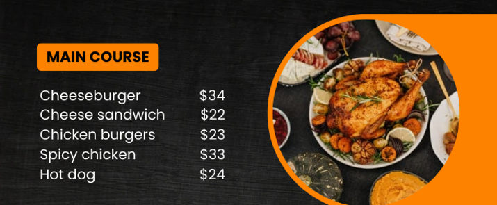
8. Montserrat

If you want a large and bold header for your menu, Montserrat is a good choice. The words “Food Menu” in the screenshot above are in Montserrat.
It does make sense for that particular menu, since it sells items such as cheeseburgers. There is no need for an artistic flair if you are serving fast food.
As a general rule, you want your font to match the vibes of your restaurant. In some previous examples, we have seen more calligraphic fonts used for restaurant names or menu headers, which kind of makes sense for artistic coffee shops or bars. For a fast food place, it probably doesn’t.
People who are going to buy fast food aren’t interested in the experience of the place. Rather, they want a fast and quick way to eat.
9. Slopes

Meanwhile, using the same menu as an example, we notice that Slopes was used for the menu items and prices. Once again, we are aiming for a simple and legible font for the menu items.
Slopes does a good job of doing that, yet it does have a tiny bit of flair to it, which is very subtle and doesn’t really impact its legibility.
Interestingly enough, numbers in Slopes are a bit more artistic than letters, as you can see if you take a look at the prices in the screenshot. Nevertheless, they are still very legible and clearly defined.
10. Poppins
Next up, we have Poppins, which is a simple, clear, and legible font. It is used for the menu items, prices, and subheadings of the menu from the last example.
As you can see, it’s clear and legible. It’s straight to the point and stands out, without trying to make a statement.
Conclusion
While these are the fonts I love personally, there are many other fonts you can use. However, remember to use a legible font that is easy to read for the menu items.
For the menu header or restaurant name, you can be a bit more flexible, depending on the type of food establishment you are creating the menu for.
Adding a flowery font can certainly set a mood, so don’t be afraid to use it for chic cafés and bars!