Typography is the silent ambassador of your brand, communicating subtle messages through the shapes and styles of letters.
Canva has revolutionized the way professionals approach typography by offering an impressive collection of free, high-quality fonts.
Whether you’re crafting a corporate presentation, designing a business card, or creating content for social media, the right font can elevate your message from ordinary to memorable.
This curated list explores 15 of the most versatile, professional, and impactful free fonts available on Canva that have stood the test of time and continue to be designer favorites across industries.
Let’s find out more.
Check Out: Best Retro Fonts On Canva
1. Montserrat
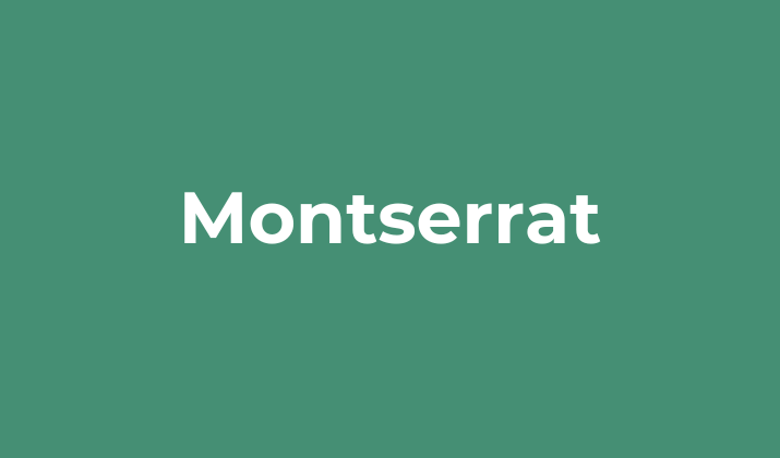
Montserrat stands as one of the most beloved sans-serif fonts in professional design, inspired by the historic urban typography of Buenos Aires’ Montserrat neighborhood.
Created by Julieta Ulanovsky, this geometric font offers exceptional readability across various sizes while maintaining a warm, approachable character.
Its diverse weight range from thin to black makes it incredibly versatile for headlines, body text, and everything in between.
Montserrat’s clean lines and balanced proportions have made it a staple in corporate branding, particularly for businesses seeking to convey modern professionalism without appearing cold or impersonal.
2. Playfair Display
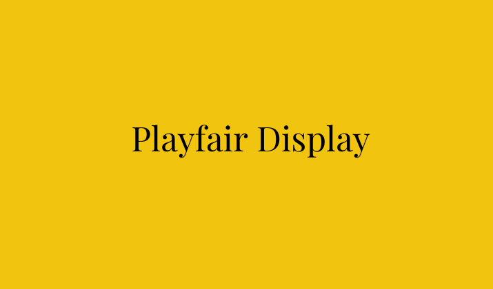
Playfair Display brings classical elegance to the digital world with its distinctive contrast between thick and thin strokes.
This serif typeface, designed by Claus Eggers Sørensen, draws inspiration from the transitional typefaces of the late 18th century, exhibiting high-contrast letterforms and refined details.
The font shines particularly in larger sizes, making it perfect for headlines, titles, and display text in formal communications.
Its subtle curves and sharp serifs convey sophistication and intellectual authority, making it an excellent choice for law firms, educational institutions, and luxury brands that want to project heritage and trustworthiness.
Check Out: Best Arabic Fonts On Canva
3. Lato

Lato, created by Polish designer Łukasz Dziedzic, strikes a perfect balance between warmth and professionalism.
Its name, meaning “Summer” in Polish, reflects the typeface’s sunny, friendly character despite its structured foundation.
What makes Lato special is its subtle blend of geometric shapes with softened corners and curves, creating a sense of harmony and stability.
The semi-rounded details give Lato a feeling of warmth, while the strong structure provides clarity and elegance.
This duality makes it exceptionally versatile for corporate communications, particularly in healthcare, technology, and financial services where approachability and professionalism must coexist.
4. Open Sans
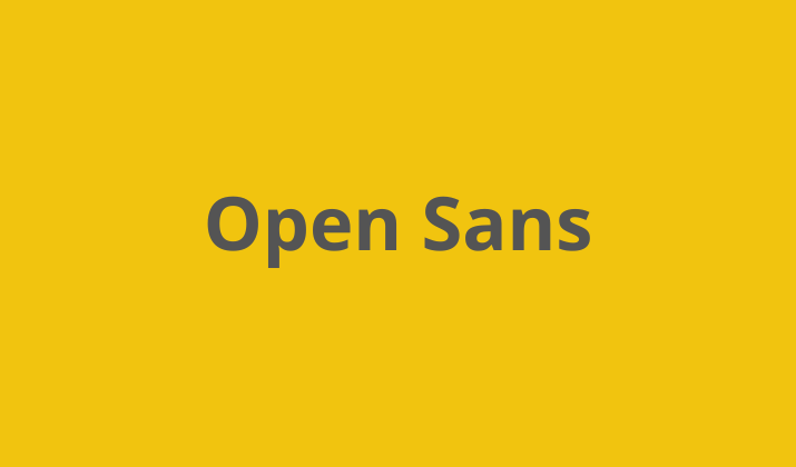
Open Sans has earned its reputation as one of the most versatile workhorses in typography.
Designed by Steve Matteson and commissioned by Google, this humanist sans-serif font prioritizes clarity and neutrality across digital and print media.
With its open forms, neutral appearance, and excellent legibility even at small sizes, Open Sans performs exceptionally well in body text, interfaces, and information-dense documents.
Its extensive character set supports over 100 Latin-based languages, making it ideal for multinational businesses and global communications.
The font’s balanced look works harmoniously across platforms while maintaining a friendly, professional appearance.
Explore: Best Canva Fonts For Menus
5. Roboto
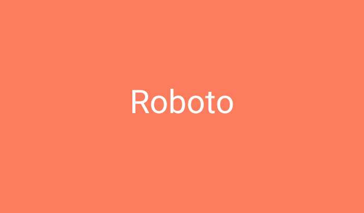
Roboto, designed by Christian Robertson for Google’s Android operating system, has become a defining font of the digital era.
This neo-grotesque sans-serif combines geometric forms with friendly, open curves to create a highly readable typeface across all screen resolutions.
Its mechanical skeleton gives it a structured rhythm, while the forms are largely geometric with friendly and open curves. This dual nature allows Roboto to remain neutral yet friendly in various contexts.
With its exceptional screen performance and comprehensive family including condensed and slab serif variants, Roboto has become the go-to font for digital-first businesses and responsive design projects.
6. Bodoni

Bodoni represents timeless elegance and contrasting beauty in the typography world.
This classic serif typeface, originally designed by Giambattista Bodoni in the late 18th century, is characterized by its dramatic thick-thin transitions and perfectly circular dots.
The modern Canva versions maintain the original’s vertical stress and geometric construction while adapting for digital applications.
Bodoni’s dramatic contrast makes it particularly striking in headlines and display text for fashion, luxury, and editorial designs.
The font conveys refinement, exclusivity, and historical gravitas, making it perfect for brands that want to project classical sophistication and artistic sensibility.
Explore: Best Canva Fonts For Poems
7. Poppins
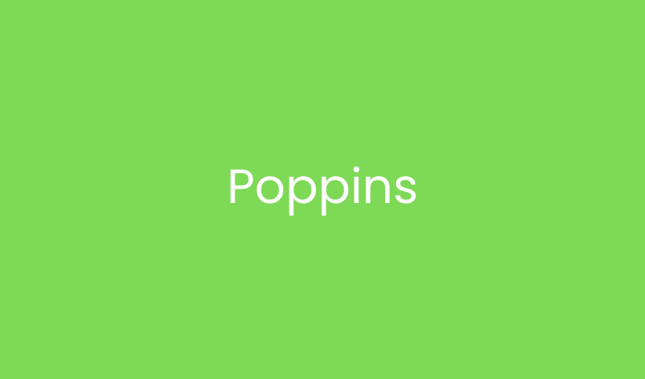
Poppins has rapidly become one of the most popular geometric sans-serif fonts for modern business applications.
Designed by the Indian Type Foundry, this typeface is an inclusive font that supports both the Latin and Devanagari writing systems.
Its geometric structure is softened with rounded terminals, creating a friendly yet precise aesthetic.
Poppins features consistently circular rounds and equal width proportions across all letterforms, giving it a mathematical harmony that works beautifully in tech startups, educational materials, and contemporary brands.
Its clean, minimal design provides excellent readability while projecting a forward-thinking, international outlook.
8. Merriweather
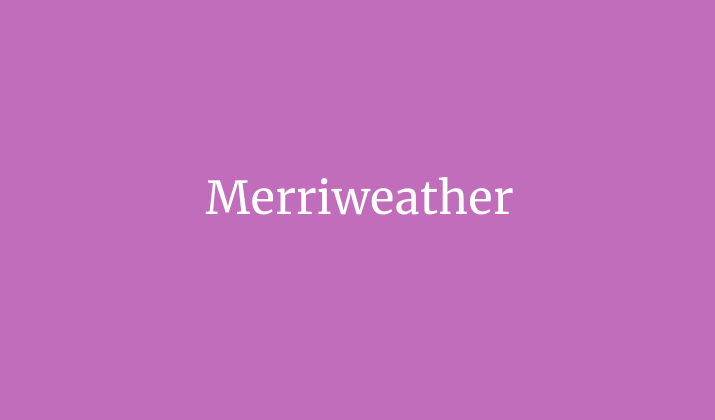
Merriweather was designed specifically to enhance on-screen reading experiences while maintaining a traditional literary quality.
Created by Eben Sorkin, this serif typeface features a generous x-height, sturdy serifs, and open forms that combine to create exceptional readability even at small sizes.
Merriweather’s slightly condensed letterforms allow for economical use of space without sacrificing clarity, making it ideal for long-form content like reports, case studies, and academic publications.
The font’s traditional structure paired with modern adaptations for digital reading creates a bridge between classical authority and contemporary functionality.
Also Read: Best Canva Fonts For Logos
9. Raleway
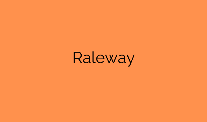
Raleway began as a single thin weight designed by Matt McInerney but has evolved into an elegant sans-serif family spanning nine weights.
This distinctive typeface features stylish alternates like a unique ‘w’ that showcases its personality while maintaining professional credibility.
Originally inspired by geometric sans-serifs of the 1920s and 30s, Raleway combines art deco sensibilities with modern digital needs. Its light weights convey elegance and refinement, while heavier weights project confidence and authority.
This versatility makes Raleway particularly effective for architecture firms, design studios, and creative businesses that want to showcase both artistic sensibility and professional capabilities.
10. Nunito
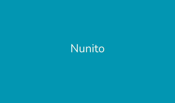
Nunito represents the perfect balance of professional roundness and readability.
Designed by Vernon Adams, this rounded terminal sans-serif font has evolved from its original rounded terminals to include both rounded and sharper variants.
Its well-balanced proportions create a harmonious flow while maintaining excellent legibility across sizes.
Nunito’s friendly appearance doesn’t compromise its professional credibility, making it particularly effective for educational materials, healthcare communications, and children-focused businesses.
The font projects approachability and expertise simultaneously, with rounded forms that feel welcoming without appearing childish or unprofessional.
Check Out: Best Canva Fonts For Quotes
11. Oswald
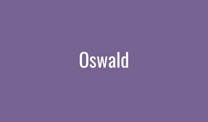
Oswald represents a modern reinterpretation of the classic gothic and grotesque style of sans-serif typefaces.
Designed by Vernon Adams, this condensed sans-serif was originally conceived as a web font alternative to standards like Alternate Gothic.
Its narrow, tall letterforms allow for space-efficient typesetting without sacrificing impact or readability.
The font’s condensed nature makes it particularly effective for headlines, banners, and situations where space is at a premium but visual impact is essential.
Oswald’s strong vertical emphasis and tight letter spacing create a powerful, commanding presence that works exceptionally well for event promotion, sports branding, and urban-focused businesses.
12. Cormorant
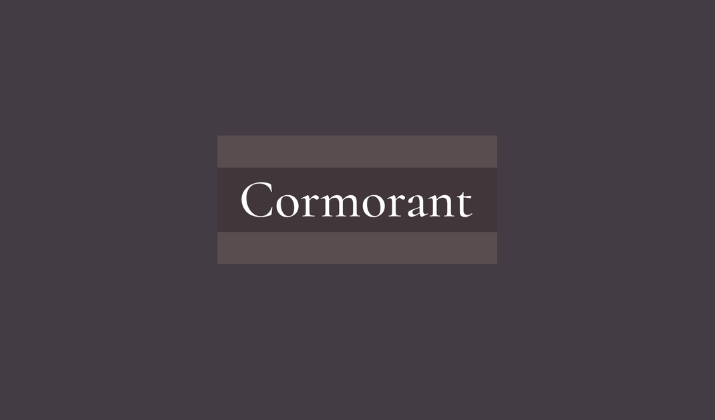
Cormorant brings the refined elegance of optical size-specific design to the digital world.
Designed by Christian Thalmann, this display serif typeface draws inspiration from Claude Garamont’s 16th-century designs but reimagines them with extreme contrast for contemporary use.
What makes Cormorant special is its deliberate optimization for medium to large sizes, where its delicate hairlines and dramatic contrast can truly shine.
The typeface includes several variants including Garamond, Infant, and Upright, each offering subtle variations on the elegant theme.
Cormorant excels in high-end invitations, luxury packaging, and editorial design where sophisticated beauty takes precedence over utilitarian concerns.
Explore: Best Canva Fonts For Posters
13. Quattrocento
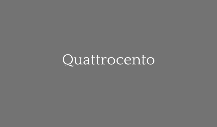
Quattrocento offers a contemporary interpretation of classical Roman inscriptional letterforms.
Designed by Pablo Impallari, this serif typeface combines historical references with modern usability considerations.
The font features elegant, balanced proportions with a generous x-height and clear, open counters that ensure readability across various applications.
Quattrocento’s slightly condensed letterforms allow for economical use of space while maintaining elegance and clarity.
The typeface particularly shines in applications related to art, culture, history, and education, where its classical roots support content with historical or intellectual significance.
Its timeless quality makes it appropriate for museums, galleries, and academic institutions.
14. Work Sans
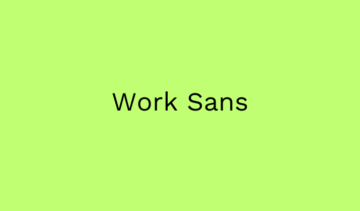
Work Sans represents thoughtful design for contemporary professional communications.
Created by Wei Huang, this sans-serif typeface was optimized specifically for on-screen text usage at medium sizes (14px-48px).
The family is loosely based on early Grotesques but features more humanist characteristics and optimizations for modern display environments.
Work Sans offers a comprehensive range from thin to black weights, with the regular styles optimized for body text and the extremes designed for display use.
Its clean, neutral appearance makes it highly versatile across industries, while subtle details like slightly rounded terminals and strategic contrast modulation create a distinctive, contemporary feel that works particularly well in digital-first businesses and modern corporate communications.
15. Georgia
Georgia stands as a testament to thoughtful design for digital reading environments.
Created by Matthew Carter for Microsoft, this serif typeface was specifically engineered to remain legible even at small sizes on low-resolution screens.
Its generous proportions, open counters, and sturdy serifs contribute to exceptional readability in digital formats while maintaining the authoritative appearance of traditional serif typefaces.
Georgia has become particularly valued for its performance in body text for legal documents, academic publications, and financial reports where extended reading and complete comprehension are essential.
Its balanced appearance works equally well in print and digital formats, making it a truly versatile professional font.
Explore: Best Barbie-Inspired Canva Fonts
Conclusion
Typography remains one of the most powerful yet underappreciated elements of professional communication.
The fonts showcased in this collection represent the perfect intersection of aesthetic appeal, functional excellence, and accessibility through Canva’s platform.
It’s not just the visual appeal of these typefaces, but their versatility across contexts and their ability to communicate subtle brand attributes through their forms, that make them special.
As design trends evolve and digital platforms multiply, these timeless typefaces continue to demonstrate remarkable staying power.
By thoughtfully incorporating these professional fonts into your designs, you elevate not just the appearance of your communications, but their effectiveness in conveying your message with clarity, authority, and style.
Enjoyed the post?